SUCCES is a set of rules developed over the last few years by the IBCS (International Business Communication Standard). This kind of standardization in business finds an increasing number of supporters who use it in their daily work when creating reports and dashboards. The SUCCESS acronym is formed by the principles of the IBCS standard, which are part of three pillars i.e. conceptual, structural and perceptual:
SAY: Convey a message
UNIFY standardize the designations
CONDENSE: Increase information density
CHECK visual integrity
EXPRESS choose the right visualization
SIMPLYFIY avoid clutter
STRUCTURE organize the content
The application of above guidelines results in both the authors and consumers noticing new qualities in reports. They also reduce the costs, and shortend the reaction time for the delivery of new reports, enabling the management to make faster and better decisions.
SAP also noticed how IBCS standards can improve work in the FP&A area, that’s why it implemented mechanisms allowing SAP Analytics Cloud creators to design reports in accordance with those standards (thus also obtaining an IBCS certificate). IBCS standards in SAC complement the unique combination of tool’s functionalities, ranging from analytics, planning to machine learning predictions. All of this on one platform.
But what does it mean exactly?
Literally speaking, it’s a brand new experience in the decision-making process. There is no need to integrate and switch to other tools while doing planning, BI, statistical etc. everything is readily available to you just from your web browser.
But let's go back to IBCS. It’s the main topic of this article after all 😉
IBCS also includes style patterns, i.e. matching legend and font sizes, specifying the standard format for numbers, lines and borders, colors and patterns etc.
How does it look in practice?
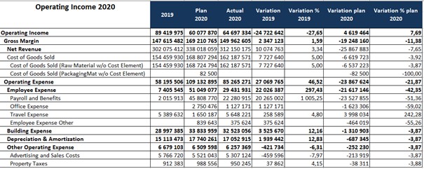
Let’s start with a simple case – we want to show a 2020 Operating Income report. Report guidelines
- Tabular form
- Must include title
- Hierarchical layout showing financial items
- Columns: actual value, previous year value, plan, absolute and percentage variances
The same report made in SAP Analytics Cloud using the IBCS concept
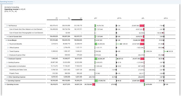
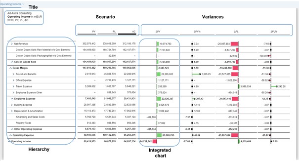
Some of the distinguishing features of the IBCS approach, visible in this report, are
- Title describing the content of the report (top left)
It should contain three elements:- The first line is for the reporting unit
- The second line for measure
- Third for Time, scenarios, variances
- Scenarios
In this case, we have 3 scenarios - value of the previous year (PY), planned value (PL) and the current value (AC). Scenarios are distinguished by colors:- PY (light gray)
- PL (dark gray)
- AC (dark gray)
- Variances for absolute and percentage values for the previous year and planning (∆PY, ∆PY%, ∆PL, ∆PL%).
Note that the variances are shown on an integrated charts. Depending on the type of displayed values, you can choose from:- The pin chart showing percentage variation
- The bar graph showing absolute deviations
Visualization with the help of an embedded chart significantly increases the readability and ease of understanding of report content, drawing more attention to the presented issue. The color for the deviations is red and green. It’s also worth paying attention to the row structure, which is displayed in a hierarchical form. This kind of layout shows the structure of the financial items whose nodes form automatic summaries. Each level in the hirerarchical structure is properly formatted, i.e. bold, underlined (dotted and bold lines), the distance between columns. There is no coincidence here - everything is in line with IBCS standards.
All formatting comes as a dynamic, preset style. The user does not have to click through the row structure and format the selected nodes manually- SAC does it all for him. So far, no tool has offered such a solution
It is worth to emphasize that:
- the report can be fully dynamic, i.e. we can use filters to show specific items, choose a time period, measure or define filters by default so the report refreshes each time with previously set parameters
- selected filter values can be dynamically shown in each of the title’s line
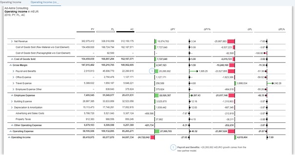
Depending on the situation, in order to emphasize the information provided, a message can be added above the title. We can also add comments on the report itself. A report like this is ready to use and print.
IBCS standards don’t apply to reports and dashboards only – they can also enhance planning forms. Example below:
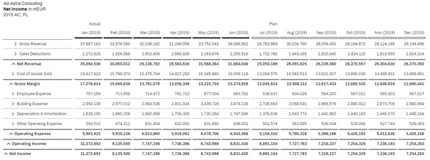
From the technical standpoint, the division into actual values (dark gray line in the header) and forecast (diagonal filling of the column header) plus table formatting (lines, summaries, etc.) is recognized by SAC automatically, in accordance with IBCS. The whole thing looks like a report, but the forecast part is ready for data entry (manual or distribution based).
Sources:
1. https://www.ibcs.com
2. IBCS standards doc (pdf.)
3. „Solid Outlined Hatched” Hichert Faisst

