As technology advances, mobile devices, tablets and smartphones are becoming an integral part of our lives. This dependence also extends to our professional lives and the way we conduct business.
For this reason, every year customers increasingly prefer viewing data and reports on mobile devices. Truly, this shouldn’t be a surprise to anybody - practically all of us do not part with our phones. This trend results in reports being accessible from anywhere, at any time, supporting business decisions in a better and faster manner.
However, the usage of mobile devices is associated with certain limitations, such as a much smaller screen and resolution compared to the ordinary PC. These factors may also differ significantly depending on the smartphone model. This could make preparing an application that would display all the necessary data in a legible and intuitive manner a challenge. Fortunately, modern BI software offer many ways of dealing with this problem. In this article we will explain one of them.
Our goal - creating a responsive structure for the application that changes depending on the orientation (vertical / horizontal) and resolution of the mobile device. To accomplish this, we will be using SAP Lumira Designer. As Lumira's built-in scripting language currently doesn’t support detecting a change in screen resolution, we will also be using the built-in support for CSS scripts.
Step 1 - Create a new application based on an empty template.

Step 2 - Add two panels to the application and maximize them (Maximize Selected Component button). Panels are container-type objects into which we can place other elements. Place a chart in one of the panels, and a Crosstab in the other. Maximize them both so that they overlap each other (see – picture below).
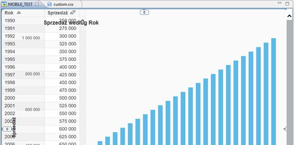
Step 3 - Create a new new CSS file for the application
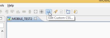
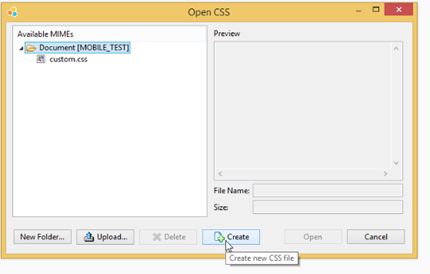
Step 4 - Add the CSS rules
Using the @media rule, we can define dynamic CSS properties that become active only when the given conditions are met.
We will start with a simple rule that checks if the device screen orientation is set to “landscape”.
@media screen and (orientation:landscape)
	{

	}
Between the braces we enter CSS properties that become active when the condition is met. In this example, let's try hiding one of the objects (as a reminder, we hide the Panel type object).
@media screen and (orientation:landscape)
	{
		   	#PANEL_1_panel1		{ display: none;}
	}
Where: "PANEL_1" is the name of our panel in Lumira Designer.
"PANEL_1_panel1" is the Panel’s ID as read by CSS
{ display: none; } - CSS rule that hides the specified element.
We will now add a second @media rule which will hide the second panel, this time in portrait orientation.
@media screen and (orientation:landscape)
	{
		   	#PANEL_1_panel1		{ display: none;}
	}
@media screen and (orientation:portrait)
	{
		   	#PANEL_2_panel1		{ display: none;}
	}
Step 5 - Save changes and run the application.
If we have performed all the steps correctly, only one panel should be visible on mobile devices or their simulation at a time.
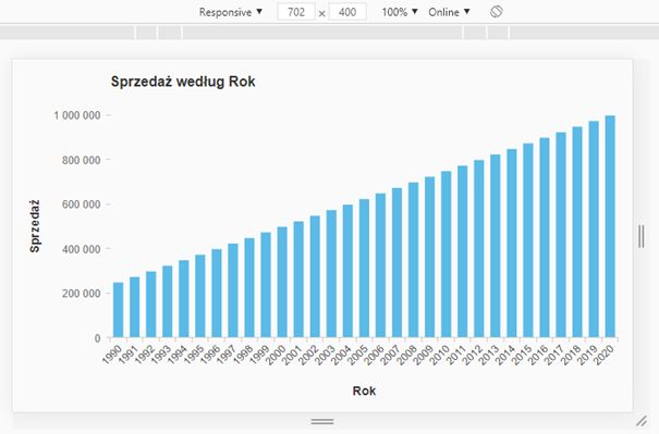
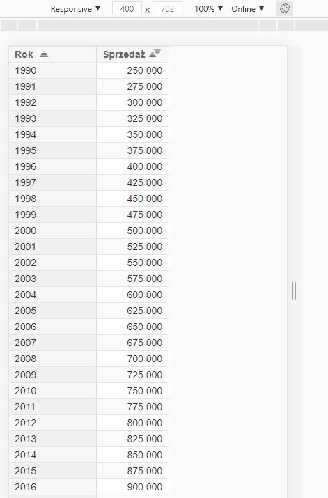
- Save changes and run the application. If we have performed all the steps correctly, only one panel should be visible on mobile devices or their simulation at a time.
For example, if the properties are to be active when the a) screen height is in the range of 375-413 pixels, and b) the screen height is smaller than its width (as in “Landscape” orientation) , we can use the following rule:
@media screen and (min-height: 375px) and (max-height: 413px) and (orientation:landscape)
	{
	   	#PANEL_1_panel1		{ display: none;}
   	}
The internet is filled with templates for specific phone models. On this note, I hope you found the article useful. Thanks for reading!

