Perfomance Analysis Tool is a tool for viewing performance statistics that SAC automatically collects and stores in SAP Hana internal views. This tool is available with update 2021.02 and 2021.Q1 QRC, by default in the system folder directory in the SAC Content folder.
The statistics content of the SAC consists of the following analytical models:
– SAC_STATISTICS_MDS_QUERY_PERF (backend statistics)
– SAC_USER_FRIENDLY_PERF_ACTION ((frontend statistics)
– SAC_PERFORMANCE_E2E (network statistics as well as performance for a single user)
Their purpose is to provide visibility into information related to the backend, network and user interface.
Perfomance Analysis Tool is based on the SAC_PERFORMANCE_E2E analytical model - in this case, the aforementioned content helps with the analysis of individual runs of reports or analytical applications
How to use SAC Perfomance Analysis Tool?
The tool can be run from the system folders directory, SAC Content folder.

The tool can be run from the system folders directory, SAC Content folder.

Ekran startowy PAT it consists of a search bar that allows you to narrow down the area on which you want to display statistics. The available options allow you to:
- Setting the filter to date (the current day is selected by default)
- Optional refinement of the search by selecting specific users and resources.
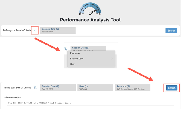
To confirm the criteria press Search . A list of individual resource launches will appear. By clicking on the entry that interests us, we will go to the analytical part of the tool, which allows you to review the selected report or application.
At the top of the interface there is a button that allows you to return to the start screen, where we can restart the analysis or change the filtering criteria. The button in the upper right corner of the page allows you to change the displayed analysis format (seconds or milliseconds)

Overview section:
Below, divided into five columns, is an Overview (Some of the visualizations can be used to filter the tables and charts on this page.).

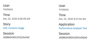
The first column consists of information about the user and the selected resource. This information includes: Username, Timestamp, Report or Application Name, and Session ID. Note that the combination of resource ID and session ID is unique. It is also possible to open the asset under test directly from the tool which can be helpful in understanding the design, structure and complexity.
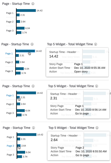
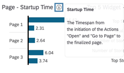
Next to this section, you can find information about individual pagesthat were part of the analyzed workflow. For each used page, we see the launch time - this is the time from the start of the action (e.g. opening a report or going to a specific page) to the full rendering of the last object on the page. Hovering the cursor over the graph elements shows the start time and name of the event. If a page has been visited twice, the chart will also show twice, as well as Page 1 and Page 3 in the example.
The third column is a graph of the top 5 widgets in terms of execution time. The times displayed are the sum of a single widget execution time. If the widget has been loaded more than once (e.g. the report has been opened many times or the filter criteria have been changed), each such loading is additionally added to this sum.
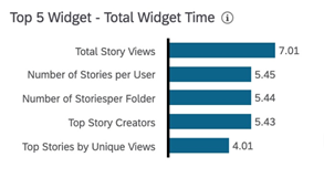
Fourth column is a chart with all the models that were actively used when the resource was started and their maximum operating time in the backend system. Only their single maximum value is shown here. Hovering the mouse over the graph will show the connection used by the model.
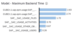

The last section in the header is a distribution of the runtime among processing layers. This section contains two widgets that allow you to compare the maximum times per processing layer with the median of the corresponding layer.
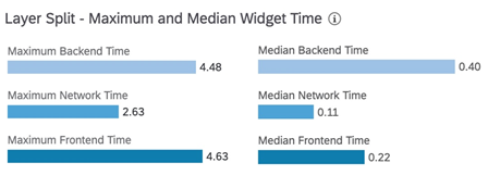
Each of these widgets has an information icon - clicking on it will display a brief explanation of the widget and the indicators used.
Below the Overview section are three tables - Runtime Distribution, Page Load Time and Widget Drilldown.
Runtime Distribution zawiera czas rozpoczęcia akcji, jej nazwę oraz numer strony. Wskaźnik przedstawiony na wykresie to całkowity czas działania, stanowiący zagregowaną wartość wszystkich widżetów uruchomionych przez akcję.

Page load time structure similar to the previous chart, but with different indicators and no aggregation. The total time per action is shown - from the moment of its initiation to the rendering of the last widget on the page. This value can be divided into Page Preparation and Widget Load Time. To preview the complexity of an object, the number of widgets per action or page is also shown.

Page Preparation is the time from the start of the action to the start of loading the first widget.
Widget Load Time is the time from the beginning of the first widget to the end of rendering of the last widget.
The sume of those elements is a total time of an action.

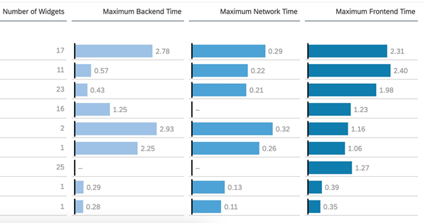
The last columns of this view are the maximum values for each processing layer.
Looking at the examples, we can see that for Open Story on page 1, one of the 17 widgets took 2.78s in the backend system, the same or another widget took 0.29s in the network and the same or another widget took 2.31s in the frontend system.
At first glance, this structure may seem not very detailed, but thanks to it, we can directly detect actions that had no interaction with the backend system and were processed only in SAP Analytics Cloud.
Widget drilldown allows you to implement data down to the level of a single widget per action, model or page. Especially useful in this area is the filter bar above the tabs - it shows the current state of the filter, which applies to all views and charts below.
Filters can be set by clicking on the graph elements of interest in one of the three mentioned tabs or in the Overview section. The bar also allows you to remove existing filters. In the example, the filter was set to Page 1 and the action "Open story".

We now get a complete list of all the widgets that were rendered on page 1 for Open Story, information like name, type, and end-to-end time for each widget.
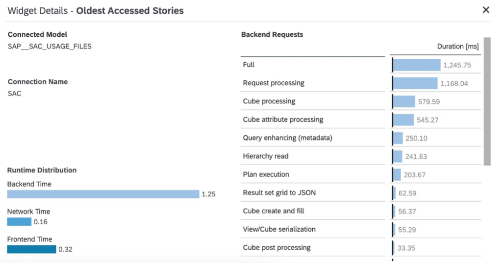
To get more details, we can go to Widget Details. For this purpose, we mark a specific position in the Widget Drilldown . This causes an additional filter to be set and detailed data to be displayed.

Widget Details contain information about the model used by the selected widget, the connection used by the model, runtime distribution, and display full requests to the backend.
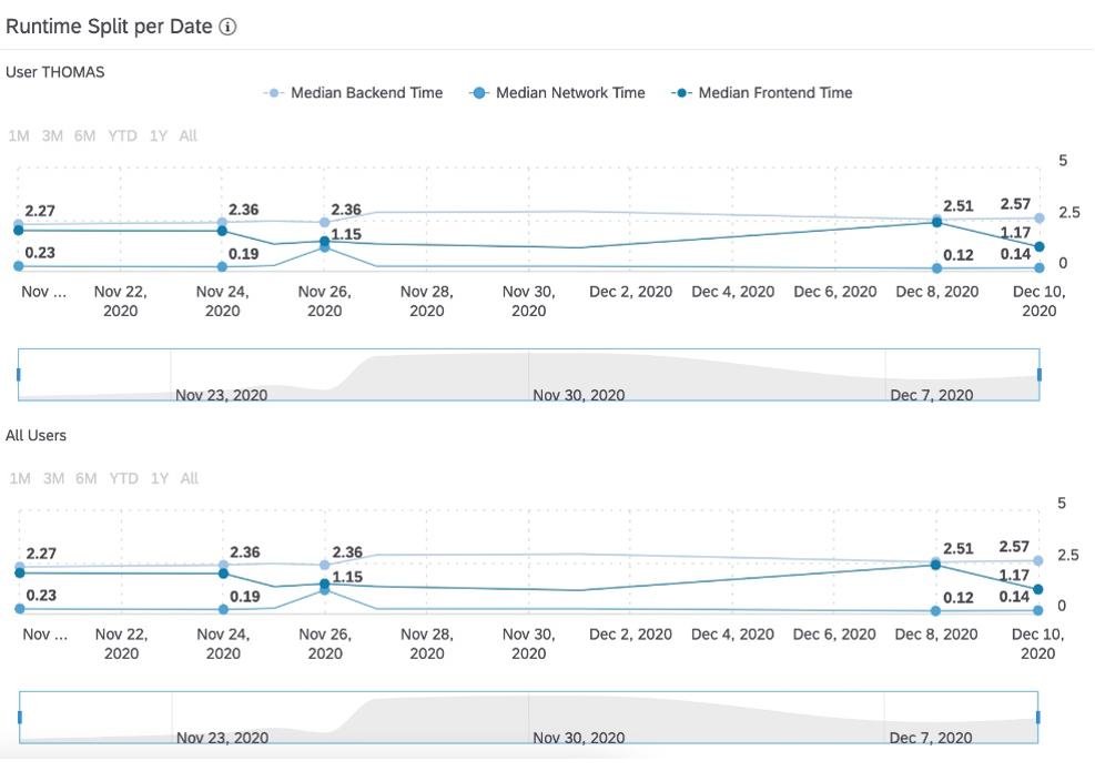
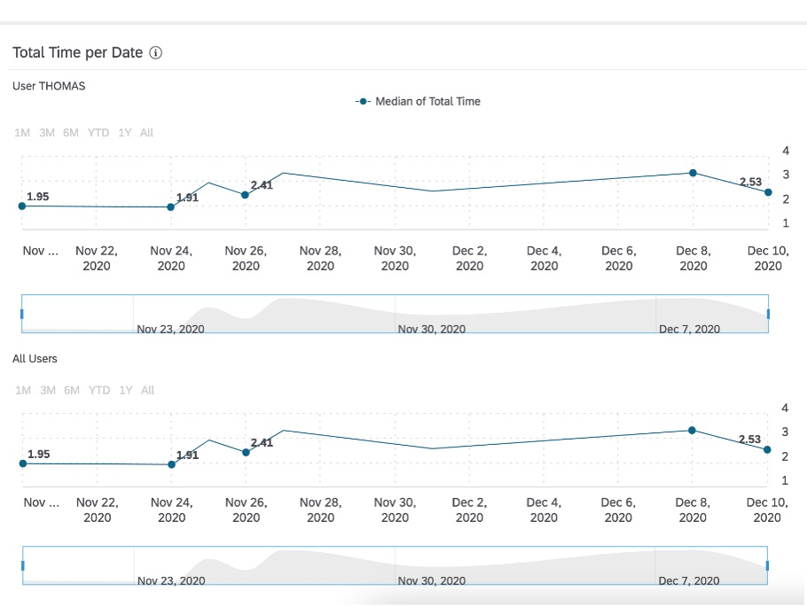
The last part of the Performance Analysis Tool consists of Time-Series Charts. They allow you to compare the execution times for a single user against all SAC users, both at the page and widget level (the filtering mechanism works the same as in the previous items).
In this section, the visualizations are divided into two groups - the charts on the left focus on the median execution times, while the charts on the right show the distribution of the execution times per layer.
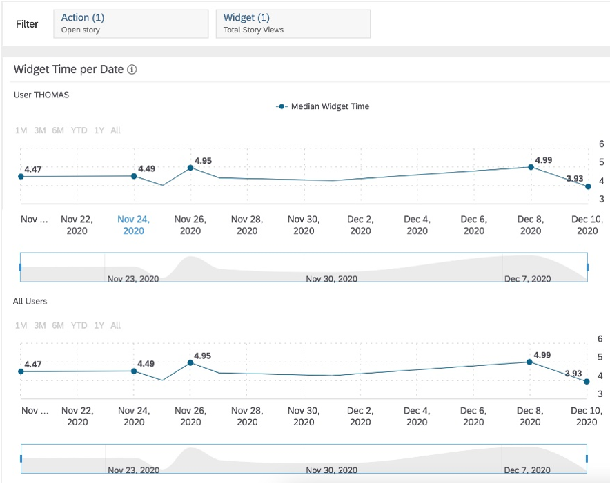
When you apply a filter at the widget level, the measures and chart titles will change - Median of Total Time and Total Time per Date will be changed to Widget Time per Date and Median Widget Time
Total Time per Date
Widget Time per Date
The chart group on the right has the same logic. When a filter is applied at the widget level, they update to reflect the distribution of runtime for a single widget. The titles and indicators do not change.
Breakdown of Execution Time by Date - Action Level
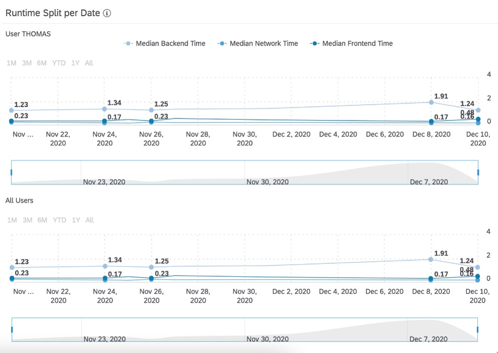
Breakdown of Execution Time by Date - Widget Level
